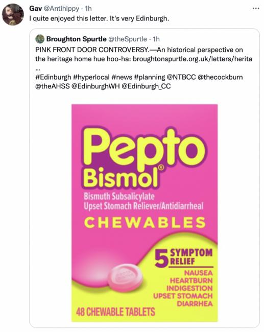
Dear Spurtle,
With reference to the recent hoo-ha over a pink front door in historic Drummond Place, Edinburgh Council needs to address the very many far more serious breaches of listed buildings control in the New Town (e.g., the glass-carbuncle roof terrace on Abercromby Place, not 40m away from the property in question) before nitpicking of this sort. The capricious and inconsistent way these rules are enforced is a real problem – it’s almost as though they pick one easy target at random and make a martyr of them.
The ‘rules’ about what one does to the exterior of one’s property in the New Town are at least as much about trying to present a coherent and unified architectural ensemble as they are about historical accuracy. For example, railings in the Georgian period would likely have been painted some sort of green colour, supposedly to mimic bronze. However, in Edinburgh, the decision has been taken that nowadays they are to be black, full stop. It looks better for the whole if everyone does the same thing.
For what it is worth, therefore, regarding ‘historical accuracy’ (as it is not the be-all and end-all of these rules), one really can do no better than to acquaint oneself with the writings of Patrick Baty (examples here and here), an expert on historic paint who has devoted himself to studying, by means of actual historic paint samples under the microscope, the paint schemes used by successive generations on historic buildings.
Many online reactions to the Pepto-Bismol door in Drummond Place have argued that the Georgians themselves used bright colours on front doors and that Edinburgh World Heritage/the Council are attempting to impose a uniformity that would never have existed 200 years ago.

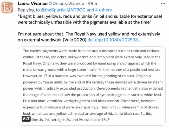
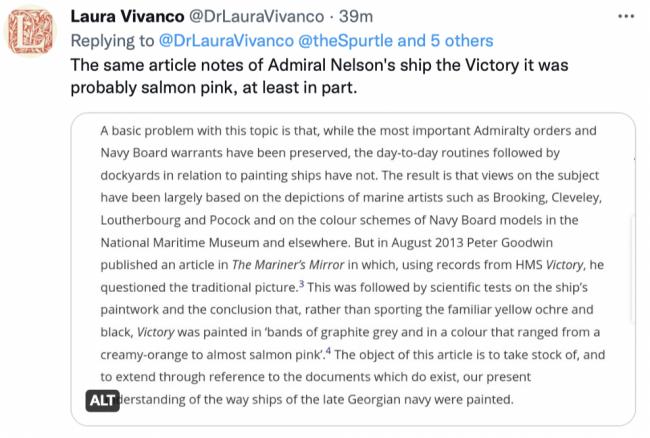
The 19th-century homeowner might not have had to contend with the heritage police, but near-uniformity would have been the inevitable result of the tiny range of colours then in existence. Bright blues, yellows, reds and pinks (in oil and suitable for exterior use) were technically unfeasible with the pigments available at the time, or at the very least were out of reach financially to anyone except the very rich.
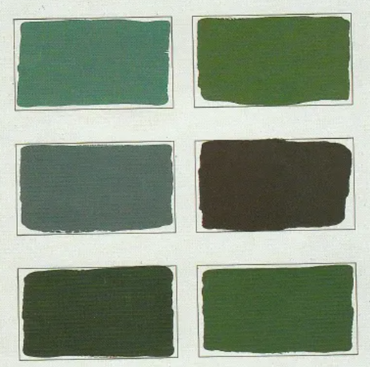
Mr Baty cites a work of 1811 which lists the colours available for outside painting as ‘white, stone colour (a creamy off-white), lead colour (a blue-grey), chocolate, olive green and invisible green’.* He continues, ‘Nearly 50 years later, exactly the same colours are referred to as being in general use, and apart from the appearance of Brunswick green** in its various forms, little had changed by the death of Queen Victoria.’ One other common treatment for woodwork, including on the exterior, was wood-graining, referred to as ‘wainscotting’.
Clearly, it’s not 1822 any more, and aspirational tones such as rototo de Pepto-Bismol, sulking room, and cuisse de nymphe émue are now possible in every paint finish. But perhaps we can allow Mr Baty the last word: ’A restrained use of colour, possibly based on historical precedent, is a useful guide for the repainting of the older house, and especially one forming part of an architectural group’ (Palette of the Past).
Caroline Roussot
(Cumberland Street)
* The intriguingly-named 'invisible green' was a dark green so called, per Humphrey Repton, as it 'harmonises with every object, and is a background and foil to the foliage of fields, trees and plants, as also to flowers.'
** Brunswick green, obtained by the mixing of chrome yellow and Prussian blue, was a brighter dark green than had previously been obtainable.
-----------------


